Creative Travel Banner Design Ideas for Your Next Campaign
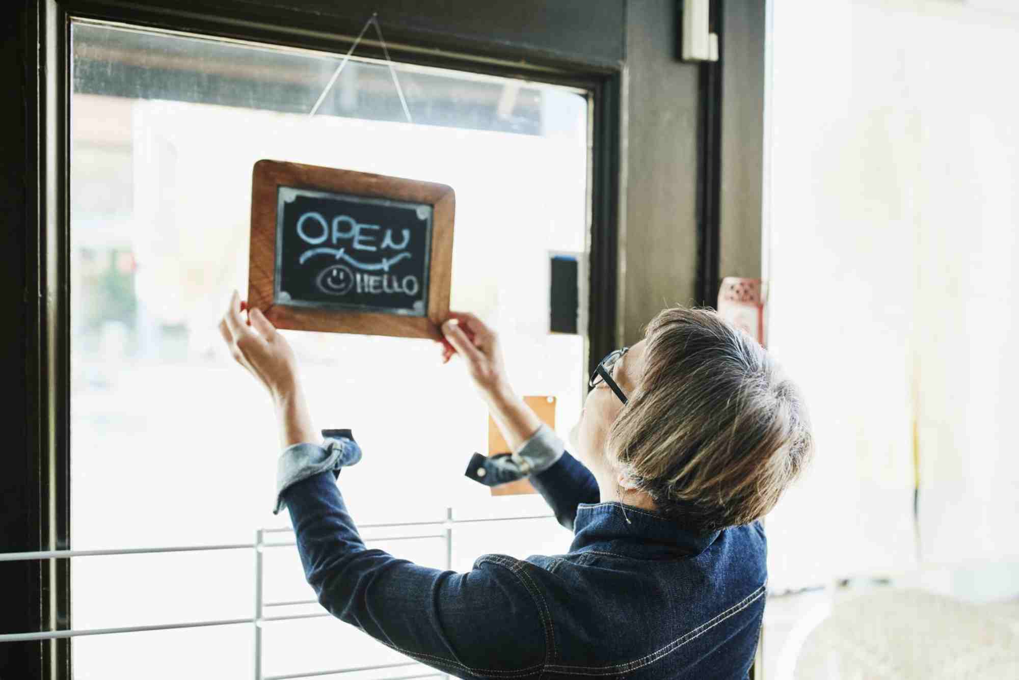
In a world where visual content dominates, travel banner design is no longer just a creative add-on—it’s a crucial element in grabbing attention and converting views into bookings. Whether you’re promoting a tour package, launching a seasonal offer, or branding a new destination, an impactful travel banner can make all the difference.
Your banner is often the first interaction a potential customer has with your travel brand. This is why designing banners with both creativity and strategy in mind is essential. From vibrant visuals to strategic placements of text and calls to action, each element plays a vital role in engagement.
The Importance of Good Travel Banner Design
Travel is all about visual storytelling. A well-designed banner instantly transports your audience into the experience. It evokes emotions—wanderlust, excitement, or peace—and compels them to click. The right travel banner design can build trust, communicate value, and differentiate your campaign from competitors.
While most travel agencies focus on content, banners often remain overlooked. However, banners offer a compact, visual method to convey your message in seconds. They work across platforms—websites, email headers, social media ads, and even print.
Essential Elements of an Effective Travel Banner Design
A creative travel banner isn’t just about pretty pictures. It’s about merging form and function. Each component should guide the viewer toward a desired action, whether it’s learning more, booking a trip, or signing up for a newsletter.
Captivating Visuals That Tell a Story
Travel banners thrive on emotional triggers. Use high-resolution images that reflect your destination’s charm. A snow-capped mountain, a serene beach, or a bustling European street—whatever it is, make sure it sparks the imagination.
Images should align with your campaign’s mood. A romantic getaway ad should look different from an adventure trekking package. Choose tones and filters accordingly to stay consistent with your branding.
Strategic Use of Typography
Fonts matter more than most realize. Elegant, clean typography maintains readability while adding personality. Don’t go overboard with styles—one or two font types are sufficient. Use contrast between font weight and background to highlight your message.
Make sure your headline grabs attention. Use larger font sizes and bold text to emphasize offers or destination names. Subtext can explain more, but it shouldn’t clutter the design.
Clear Call to Action (CTA)
A travel banner without a CTA is a missed opportunity. Whether it’s “Book Now,” “Explore More,” or “Get Your Discount,” your CTA must stand out. Use buttons with contrasting colors and place them where the eye naturally lands—often in the lower right or center.
The language should be action-oriented. Use urgency or exclusivity when appropriate: “Limited Offer,” “Last Minute Deals,” or “Early Bird Discount.”
Brand Consistency
Keep your logo visible, but not overpowering. Brand colors and fonts should remain consistent with your website and overall campaign. This builds trust and recognition, especially for repeat users.
Consistency also helps in retargeting ads. When a potential traveler sees the same aesthetic across different platforms, it reinforces your message.
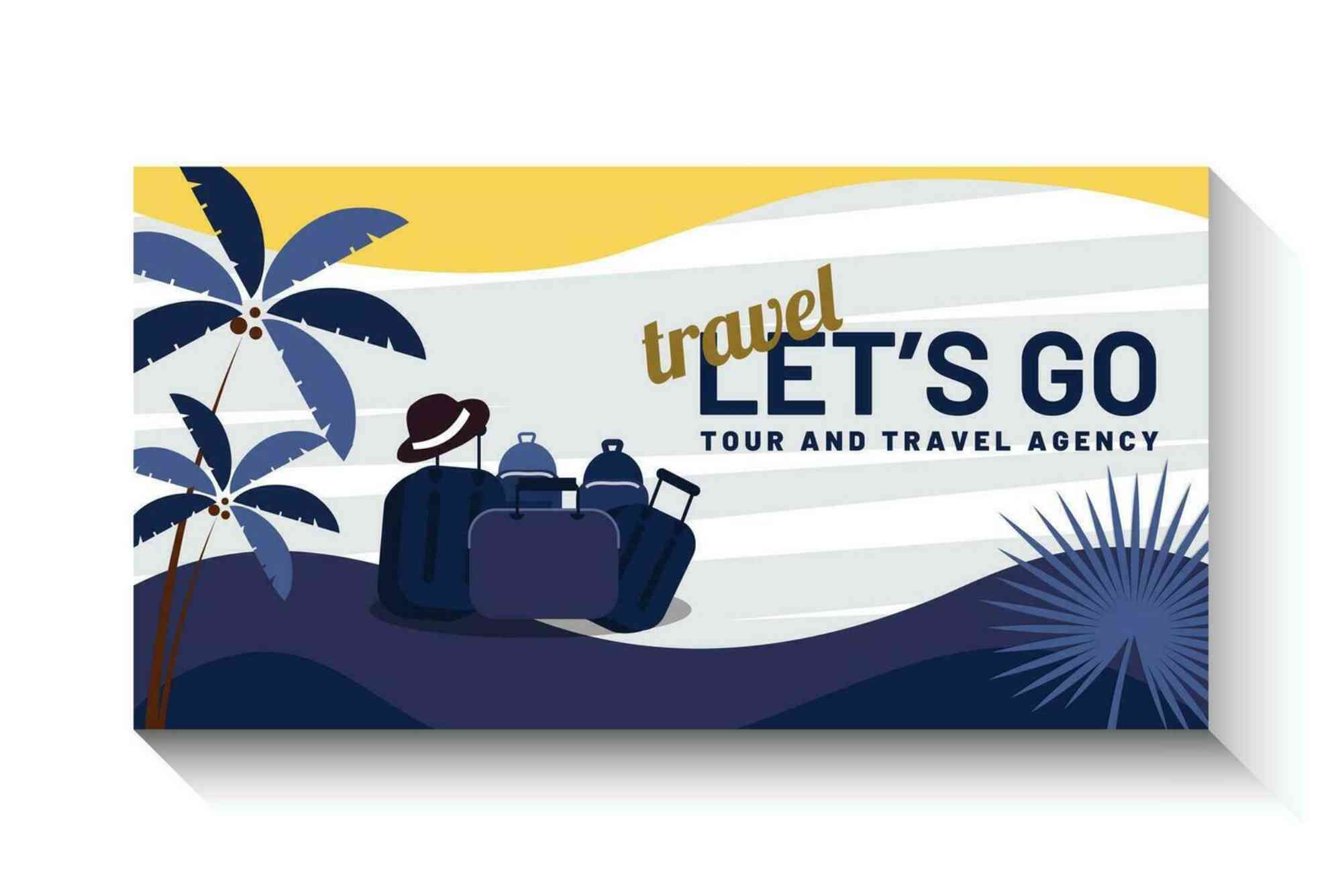
Innovative Travel Banner Design Ideas for Campaigns
Once the fundamentals are in place, you can explore creative techniques to make your travel banner design stand out. Don’t be afraid to experiment within your brand guidelines.
Animated Travel Banners for Digital Ads
Animation adds life to your campaign. Subtle movements—like waves crashing or clouds drifting—can capture attention quickly. Animated banners are ideal for digital platforms, especially social media and Google Ads. But keep file sizes optimized to maintain loading speed.
Even a simple fade-in effect on text or buttons increases engagement. Use motion to highlight deals or guide the viewer through the message flow.
Seasonal Theme Integration
Travel peaks around holidays and seasons. Tailoring your banners to these themes can boost relevance. Use elements like snowflakes, palm leaves, or festive colors to tie in with current trends. But don’t let the visuals overshadow the main message—keep it focused and clear.
User-Generated Content
Showcasing real travelers in your banner builds authenticity. A happy couple posing at a sunset point or a family enjoying a theme park adds credibility. UGC can be sourced from Instagram or testimonials (with permission) and integrated into your banner design to humanize your brand.
Minimalist Design with Negative Space
In a crowded advertising space, sometimes less is more. A minimalist banner with a clean background, a powerful headline, and a single CTA can cut through the noise. This approach works particularly well on websites where too many visual elements compete for attention.
Minimalist designs load faster, reduce bounce rates, and create a sense of sophistication.
Travel Banner Design Tips for Different Platforms
Not all platforms are created equal. Your travel banner design must adapt depending on where it’s displayed. Here’s how to make it platform-perfect.
Website Banners
Website headers or hero sections demand landscape formats and high resolution. They should communicate value immediately. Use overlay text with slightly darkened images to ensure readability.
Add scroll triggers or interactive elements like “Play Video” buttons for added engagement. Make sure banners are mobile-optimized.
Email Banners
In email campaigns, banners must load quickly and look good on various devices. Use shorter width, clear CTAs, and reduce text. Alt text is vital here since not all email clients display images by default.
Keep the visual hierarchy simple and direct the reader’s attention downward toward your email content.
Social Media Banners
Each platform has its own dimensions and user behavior. Instagram and Facebook prefer square or vertical formats, while LinkedIn and Twitter often work better with horizontal banners.
Use bold headlines and fewer words. Add your handle or hashtag to encourage engagement. Carousel formats also allow multi-banner storytelling.
Print Banners
If you’re designing for trade shows or physical travel fairs, print quality is key. Use CMYK color mode and high DPI. Focus on bold visuals and minimal text. Your contact details, website, or QR codes should be visible and scannable.
Tools and Resources for Travel Banner Design
Not everyone has access to a full design team, but that shouldn’t limit creativity. Tools like Canva, Adobe Express, and Crello offer travel-specific templates that can be easily customized.
Stock photo sites such as Unsplash, Pexels, and Shutterstock provide a wide variety of travel imagery. For animations, platforms like LottieFiles or Adobe Animate can help bring banners to life without bloating file size.
Designers should also use tools like Color Hunt or Coolors to create appealing color palettes that align with their campaign message.
Common Mistakes to Avoid in Travel Banner Design
Even with great ideas, a few missteps can ruin the impact of your banner. Avoid overloading your banner with too much text. Don’t use low-quality images or inconsistent branding. Avoid generic CTAs like “Click Here”—they say nothing about the benefit to the user.
Always test your banner on different devices and platforms before launching. What looks good on desktop might be unreadable on mobile. Previewing ensures your message lands where it matters.
Make Every Pixel Count
Travel banner design is more than an art—it’s a strategic communication tool. It bridges visual storytelling with marketing goals. When executed thoughtfully, it can boost engagement, build your brand, and turn casual browsers into passionate travelers.
The next time you launch a travel campaign, invest time into your banner design. Think creatively, test frequently, and always put user experience at the forefront.
Frequently Asked Questions
What should a travel banner include?
A travel banner should include a high-quality image, a clear headline, a call to action, your brand logo, and consistent colors and fonts.
Which size is best for a travel banner?
The ideal size depends on the platform. Common sizes include 1200×628 px for social media and 1920×1080 px for websites.
What is the best color scheme for travel banners?
Use colors that reflect your destination or travel mood—blues for calm beach scenes, greens for nature, and warm tones for adventure.
Can I use free images in travel banners?
Yes, platforms like Unsplash and Pexels offer free, high-quality images. Always check licensing before use.
Should I use animated banners for travel ads?
Animated banners are great for digital ads. They increase engagement but should be optimized for performance and loading speed.